Overview
A Control Chart is essentially a run chart (data plotted against time intervals) with the addition of upper and lower control limits. These control limits are statistically calculated based on the data under consideration. The purpose of the control chart is to discern visibly whether the points plotted fall inside or outside of the bounds of the control limits.
There are 4 types of Control Charts, each fulfilling specific purposes. The Control Chart that the Plato Data Analyzer implements is called a 'P' chart, or a chart that displays data that exists in one of two states, e.g. Yes or No.
Interpreting the Control Chart
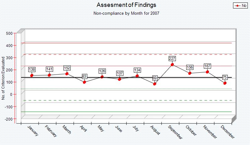
There are various ways of interpreting a control chart. By its simplest definition, the event the data represents is 'out of control' when the data points are outside the control limits, and 'in control' when the data points are within the control limits. More sophisticated interpretations of control charts would consider the number of consecutive data points trending toward the control limits, or falling into 'zones', which further divide the control limits. Following is an example control chart that shows data representing non compliance for a given event.
|
The run chart aspect of our example centers around plotting data (the blue line) for a given event ranging from January to December. The black line in the middle (at position 0) represents the mean or average of non compliant totals vs total opportunities for compliance for the entire time range.
The upper and lower control limits (solid red and green lines respectively) are calculated relative to the mean value and represent (+3 * Standard Deviation) and (-3 * Standard Deviation) respectively. The standard deviations units are calculated according to the opportunities per unit of time (in our example, month) as such
|
▪pBar = (total num non compliance instances / total num per opportunities) per time unit
▪N = total number of opportunities for entire time range
•
The dotted lines further break down the range between mean and upper and lower control limits into zones. Each zone boundary is a multiple of Standard Deviation units. In other words, the chart consists of the following reference lines starting with the Upper Control Limit:
Upper Control Limit or +3 * Standard Deviation relative to the Mean |
--Zone A-- |
+2 * Standard Deviation relative to the Mean |
--Zone B-- |
+1 * Standard Deviation relative to the Mean |
--Zone C-- |
Mean or 0 Standard Deviation |
--Zone C-- |
-1 * Standard Deviation relative to the Mean |
--Zone B-- |
-2 * Standard Deviation relative to the Mean |
--Zone A-- |
Lower Control Limit or -3 * Standard Deviation relative to the Mean |
It is against these references that the actual data points (the blue line) will be analyzed.
Following are some basic guidelines for interpreting the data plotted on the control chart. The following conditions should promote an examination of what has changed in processes and might suggest possible process adjustments.
▪Any individual points exist outside of either control limit
▪Cycles or other non-random patterns in the data
▪2 points out of 3 consecutive points are on the same side of the centerline in Zone A, or beyond
▪4 points out of 5 consecutive points are on the same side of the centerline in Zone B, or beyond
▪9 consecutive points are on one side of the centerline
▪There are 6 six consecutive increasing or 6 consecutive decreasing points
▪There are 15 points in a row within Zone C, above and below centerline.
▪
Steps
Control Chart require that the 'Yes' and 'No' values be displayed in the DataAnalyzer data section. Yes%, No%, and Total columns will be ignored even if they are displayed, so it is not necessary to filter them out first before creating the graph.
Highlight the data that you want to graph (from the Data Analyzer). To highlight data, simply left click on the starting cell and drag the mouse vertically to the last cell to include in the graph. There will be as many graphs created, as there is Rows with data highlighted. This allows for a convenient way to create multiple graphs for multiple row Data Items in a single operation. .
Plot on a new Canvas: If checked the intermediate zones (2 * Control Limit and 1 * Control Limit) will be displayed within the upper and lower control limits. If unchecked only 3 * Control Limit zone will be shown. These zones enable more precise analysis of the data plotted on the chart.
Plot on Existing Canvas: If checked this will overlay and existing graph. Multiple graphs can now be plotted for a single analyzer cube.

