Overview
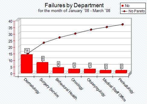
A Pareto chart is a special type of bar chart where the values being plotted are arranged in descending order. The graph is accompanied by a line graph which shows the cumulative totals of each category, left to right. The lengths of the bars represents frequency or most significant, and are arranged with longest bars on the left and the shortest to the right. In this way the chart visually depicts which situations are more significant.
Pareto chart often represents the most common sources of defects. Thus when there are many problems or causes and you want to focus on the most significant, this chart can be a helpful tool. As depicted in the example below, 60% of the failures are caused by departments 'Dermatology' and 'Surgery Services'. Thus by focusing resources to rectify failures in these two departments will solve most of the issues.
|
Steps
Highlight the data that you want to graph (from the Data Analyzer). To highlight, simply left click on the starting cell and drag the mouse vertically to the last cell to include in the graph. Only one column can be plotted at a time. To plot multiple columns, highlight the first column and plot the graph on a new canvas. Then return to the data analyzer, highlight second column and choose the previous canvas when plotting the graph.
