Overview
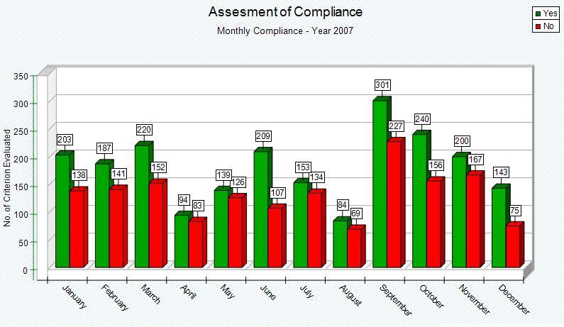
Bar Chart graph vertically oriented data. Only one column position Data Item is represented. The row position Data Items make up the labels at the bottom of the graph. The chart will plot the highlighted data under the specific Column. An example of using these charts would be to 'size up' Departments or Practitioners (located along the left or Row position of the Analyzer) compliance against a specific criterion (located along the top or Column position of the Analyzer). Once the graph has been generated it can be customized and manipulated, get familiar with it at Graph Work Area.
|
Steps
Highlight the data that you want to graph (from the Data Analyzer). To highlight, simply left click on the starting cell and drag the mouse vertically to the last cell to include in the graph. (Unless there is a good reason, it is best to exclude the Total row from the selection). There will be as many graphs created, as there are columns with data highlighted. This allows for a convenient way to create multiple graphs for multiple column Data Items in a single operation.
