Overview
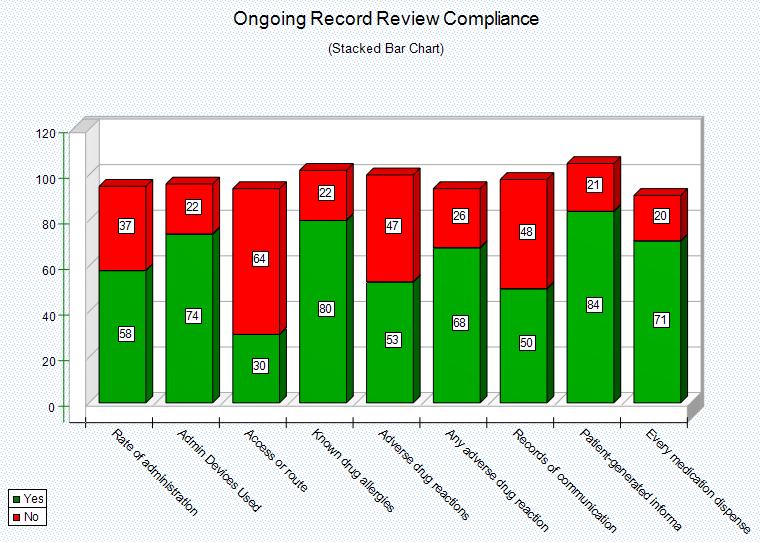
Stacked Bar Chart graphs vertical 'Yes' and 'No' data. In other words, the Data Items displayed along the top of the Data Analyzer will be the labels that appear along the bottom of the chart. The Data Items on the left of the Data Analyzer will appear as labels along the left of the chart.
The graph will plot the number of 'Yes' and 'No' in a stacked fashion, one stack for each highlighted horizontal Data Item under which they fall. This allows for easy visualization of compliance. An example of using these charts would be to graph a Practitioner or Department (located on the left or row position of the Analyzer) and their compliance to "criterion":topicsAndCriteron (located along the top or column position of the Data Analyzer). Once the graph has been generated it can be customized and manipulated, get familiar with it at Graph Work Area.
If the Data Items being plotted are actual criterion, the graph will display the allowable 'Threshold' for the criterion. However when Selecting Data Analyzer Parameters, if the 'Threshold' was not included it will not be plotted.
|
Steps
Stacked Bar Charts require that the Yes and No values be displayed in the Analyzer data section. Yes%, No%, and Total columns will be ignored even if they are displayed, so it is not necessary to filter them out first before creating the graph.
Highlight the data that you want to graph (from the Data Analyzer). To highlight data, simply left click on the starting cell and drag the mouse vertically grabbing two columns, typically the Yes and No column to get the stacked relationship.
