The Dashboard Designer provides the capability to color dashboard item elements by associating dimension values/measures and specified colors. You can choose whether to use a global color scheme to provide consistent colors for identical values or specify a local color scheme for each dashboard item.
Dashboard allows you to manage coloring for the Chart and Pie dashboard items.
Note
Note that the Chart dashboard item does not allow you to manage coloring for the financial series.
•Coloring Dimensions and Measures
Color Schemes
The dashboard provides two ways for coloring dashboard item elements.
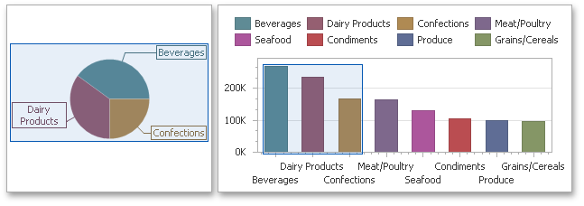
•Using a global color scheme that provides consistent colors for identical values across the dashboard. The image below shows the dashboard containing Pie and Chart dashboard items. Pie segments and chart series points corresponding to 'Bevereges', 'Condiments' and 'Diary Products' dimension values are colored using identical colors from the default palette.
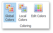
To use global colors for coloring dashboard item elements, click the Global Colors button in the Design ribbon tab.
Important
When a global color scheme is used, the dashboard reserves automatically generated colors for certain values regardless of the filter state.
•Using a local color scheme that provides an independent set of colors for each dashboard item.
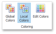
To use local colors for coloring dashboard item elements, click the Local Colors in the Design ribbon tab.
Important
When a local color scheme is used, the dashboard reassigns palette colors when the filter state is changed.
Note
By default, the dashboard colors dimension values/measures use the default palette that contains 20 unique colors. To learn how to change default colors or create a new color table, see Customizing a Color Scheme.
Coloring Dimensions and Measures
Dashboard items allow you to manage coloring individual dimensions or all dashboard item measures using predefined coloring modes.
Coloring Mode |
Description |
Default |
Dimension values/measures are colored by default. To learn how specific dashboard items color their elements by default, see Default Coloring. |
Hue |
Dimension values/measures are colored by hue. If coloring by hue is enabled, a data item indicates this using the |
None |
Dimension values/measures are colored with the same color. |
Coloring Dimension Values
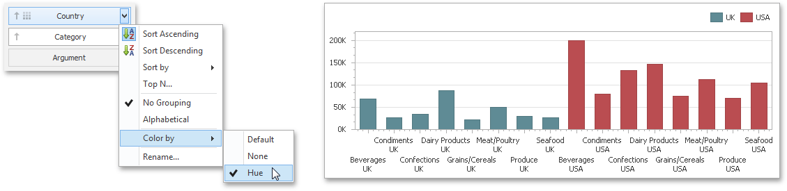
To specify the coloring mode for the required dimension, click the dimension's menu button and use the Color by submenu. For instance, the image below shows the Chart dashboard item whose 'Country' dimension is colored by hue.
Coloring Measures
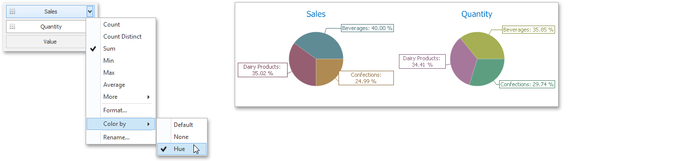
To specify the coloring mode for dashboard item measures, click the menu button of any measure and use the Color by submenu. For instance, the image below shows the Pie dashboard item whose measures are colored by hue.
If you enabled coloring by hue for several dimensions/measures, all combinations of dimension values/measures will be automatically colored using different colors from the default palette.
Default Coloring
The list below describes specifics of default coloring for different dashboard items.
•A Chart dashboard item colors different measures and series dimensions by hue.
•A Pie dashboard item colors different measures or argument dimensions by hue.