Dashboard for Desktop > Dashboard Designer > Dashboard Items > Filter Elements > Filter Elements Overview
The Dashboard Designer allows you to create three types of filter elements that provide the capability to filter other dashboard items.
To add the required filter element to the dashboard, use the Filter Elements button in the Home ribbon tab.

If you are using the toolbar menu, use the ![]() button to add the required filter element.
button to add the required filter element.

 Combo Box
The Combo Box dashboard item allows end-users to select a value(s) from the drop-down list.
You can switch the combo box type in the ribbon Design tab.
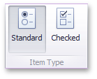
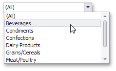
•The Standard type allows end-users to select only a single value.
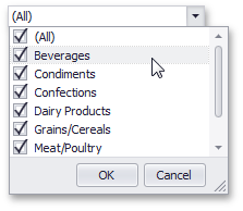
•The Checked type allows end-users to select multiple values in the invoked drop-down list.

 List Box
The List Box dashboard item allows end-users to select a value(s) from the list.
You can switch the list box type in the ribbon Design tab.
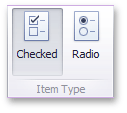
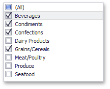
•The Checked type allows end-users to select multiple values in the list box.
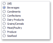
•The Radio type allows end-users to select only a single value in the radio group.

 Tree View
The Tree View dashboard item displays values in a hierarchical way and allows end-users to expand/collapse nodes.
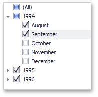
You can manage the initial expanded state of filter values using the Auto Expand button in the Design ribbon tab.
Copyright (c) 1998-2016 Developer Express Inc. All rights reserved.
Send Feedback on this topic to DevExpress.