Interface Elements for Desktop > Report Designer > Report Designer for WinForms > Report Designer Reference > Report Controls > Table Cell
The Table Cell control represents an individual cell within a Table.
In general, the Table Cell control's properties are similar to the properties of the Label control.
In the Property Grid, the Table Cell's properties are divided into the following groups.

 Appearance
•Background Color
Specifies the background color for the control. This option is also available in the Formatting Toolbar ( ).
).
•Borders, Border Color, Border Dash Style and Border Width
Specify border settings for the control.
•Font
Specifies the font settings for the control. Some of these settings are available in the Formatting Toolbar.
•Foreground Color
Specifies the text color for the control. This option is also available in the Formatting Toolbar ( ).
).
•Formatting Rules
Invokes the Formatting Rules Editor, allowing you to choose which rules should be applied to the control during report generation, and define the precedence of the applied rules. To learn more on this, refer to Conditionally Change a Control's Appearance.
•Padding
Specifies indent values which are used to render the contents of a Label.
•Style Priority
Allows you to define the priority of various style elements (such as background color, border color, etc.). For more information on style inheritance, refer to Understanding Style Concepts.
•Styles
This property allows you to define odd and even styles for the control, as well as to assign an existing style to the control (or a newly created one). For more information on style inheritance, refer to Understanding Style Concepts.
•Text Alignment
Allows you to change the alignment of the control's text. This option is also available in the Formatting Toolbar.
Behavior
•Angle
Specifies the rotation angle of a Cell's text. The measurement unit is a degree, and the orientation is counter-clockwise. Since standard HTML does not support text orientation, this parameter is ignored when a report is displayed within a web page.
•Can Grow
When this property is set to Yes, a Cell's height can be automatically increased, if required, to display the text. If there are other controls below the current Cell, they will be pushed down to prevent them from overlapping. Note that if a control overlaps the growing Cell by even one pixel, it will not be pushed down by the growing Cell.
•Can Publish
Specifies whether or not a report control is displayed in a printed or exported document.
•Can Shrink
When this property is set to Yes, and the text does not completely fill a Cell, then the Cell's height will be decreased to the height of its text. If there are other controls below the current Cell, they will be moved up to fill the gap. Note that if a control overlaps the shrinking Cell by even one pixel, it will not be pushed up by the shrinking Cell.
•Keep Together
Specifies whether the contents of a Cell can be horizontally split across pages. In other words, if a Cell occupies more space than remains on the page, this property specifies whether this Cell should be split between the current page and the next, or whether it will be printed entirely on the next page. This property is in effect only when a Cell's content does not fit on the current page. If it does not fit on the next page either, then the Cell will be split despite this property's value.
•Multiline
When this property is set to Yes, a Cell processes newline characters found in the text to start a new line. For example, when editing a Cell's text, you can insert a new line by pressing ENTER, and in this case the Multiline property will be automatically set to Yes.
•Process Duplicates
Determines the control's behavior when its data source contains consecutive repeating records. They can be processed as is (when the property is set to Leave), suppressed except for the first entry (Suppress) and suppressed with the blank space printed instead of the repeated records (Suppress and Shrink).
Merging cells with identical dynamic content is performed by setting a cell's Process Duplicates property to "Merge based on Value" or "Merge based on Tag".
•Process Null Values
Determines whether to process Null (blank) values if they appear in the control's data source. They can be processed as is (when the property is set to Leave), suppressed (Suppress) and suppressed with the blank space printed instead of the blank records (Suppress and Shrink).
•Scripts
This property contains events, which you can handle with the required scripts. For more information on scripting, refer to Handle Events via Scripts.
•Text Trimming
Specifies the string trimming mode of the control's text.
•Visible
Specifies whether the control should be visible in print preview.
•Word Wrap
When this property is set to Yes, text entered into the multiline Cell is wrapped to the next line if it doesn't fit the line or comes across a newline character. If the this property is set to No, text entered into the multiline Cell will be displayed on the same line until a newline character is entered.
Data
•(Data Bindings)
If the current report is bound to data, this property allows you to bind some of a Cell's properties (Bookmark, Navigation URL, Tag and Text) to a data field obtained from the report's data source, and to apply a format string to it. For more information on this, refer to Displaying Values from a Database (Binding Report Elements to Data).
•Lines
Provides access to the Text property of a Cell in the Multiline mode.
•Summary
Allows you to perform calculations (summary, max, min, average, etc.) over a data field. For more information on calculating summaries, refer to Add Totals to a Report.
Note
Summarization is possible for a single data column only. To perform calculations with several data fields, use calculated fields.
•Tag
This property allows you to add some additional information to the control; for example its id, by which it can then be accessible via scripts.
If the current report has a data source, the Tag property can be bound to a data field obtained from the data source. To do this, expand the (Data Bindings) property and in the Tag.Binding drop-down selector, select the required data field.
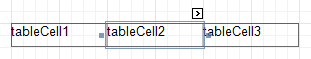
•Text
Allows you to define a line of static text to be displayed. When a Cell is selected in the designer, you may simply start typing the text, and it will be automatically entered into the in-place editor.
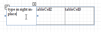
To type several lines of text, use the Lines property.
If the current report has a data source, the Text property can be bound to a data field obtained from the data source. To do this, expand the (Data Bindings) property, and in the Text.Binding drop-down selector, select the required data field. For more information on this, refer to Displaying Values from a Database (Binding Report Elements to Data).
•Xlsx Format String
Specifies the native XLSX format string for the control's content, which is to be preserved when the report is being exported to XLSX. This format string is independent from the general value formatting.
Design
•(Name)
Determines a control's name, by which it can be accessed in the Report Explorer, Property Grid or via scripts.
Layout
•Snap Line Margin
Specifies the margin (in report measurement units), which is to be preserved around the control when it is aligned using Snap Lines, or when other controls are aligned next to it.
•Width
Specifies the Cell's width, in report measurement units.
Navigation
•Bookmark and Parent Bookmark
These properties are intended for the creation of a hierarchical structure within a report called a document map. For an explanation and help, refer to Add Bookmarks.
If the current report has a data source, the Bookmark property can be bound to a data field obtained from the data source. To do this, expand the (Data Bindings) property and in the Bookmark.Binding drop-down selector, select the required data field.
•Navigation URL and Navigation Target
Use the Navigation URL property to specify a URL for web browser navigation when a user clicks a Cell. The web browser displays a page in a window or a frame as specified by the Navigation Target property. Note that a URL should have an appropriate prefix (e.g. "http://"). You can create cross-references within the report by assigning the name of the target control to the Navigation URL property, and setting the Navigation Target property to "_self". For more information, refer to Create Hyperlinks.
If the current report has a data source, the Navigation URL property can be bound to a data field obtained from the data source. To do this, expand the (Data Bindings) property and in the Navigation URL.Binding drop-down selector, select the required data field.
Copyright (c) 1998-2016 Developer Express Inc. All rights reserved.
Send Feedback on this topic to DevExpress.